Showing posts with label Logo. Show all posts

Wednesday, November 20, 2024

Jaguar goes EV gets a new logo

Well, at least this makes sense. Basically a brand changes its logo when it is either changing its product line, its target audience or its market (geographically or otherwise). Jaguar changed its logo, to do precisely that. Their vision however is clear, they want to go totally upmarket more than doubling the price of their cars, launching newly designed models, going EV, and reaching out to the more affluent clients. The strategy mind you is not unheard of - when Tag Heuer wanted to shed its cheap image and go totally upscale to reach a new clientele, we suddenly had much-better designed watches, with the price to match (and a wonderful "success. it's a mind game"). Skoda did it too mind you with its now study case "Skoda, no really skoda". So other brands have done it, why can't Jaguar?

Sure, a lot of people are revolting design wise, but these are the same people who went up in arms against Balenciaga when, honestly, they couldn't even afford their products in the first place. So let's put it this way, unless you have the funds to buy yourself the new upmarket EV Jaguar models, your opinion doesn't count. In the immortal words of Rachel Green (played by Jennifer Aniston) in Friends "no uterus, no opinion", because honestly, the new Jaguar is simply not talking to you.

Get over it.

Sunday, March 17, 2024

Decathlon: Why do companies change their logos?

Here's a thought, when a company changes its logo, it is either because it is changing its line of products, its target audience, and therefore its target market, or it has changed its whole mission statement. So when luxury companies rebrand, as in the chart below:


It was, almost always to announce the arrival of a new creative director. But such is the musical chairs play of creative directing that the turn over is so far it was not even worth it to rebrand the shops, the labels, the collections, the bags and whatever all else paraphernalia that needed rebranding. Most of the press releases when a new logo is born stress words like "humanizing" and what not. The reason is more simple. Social media. You need your logo to be as 2D as possible to be seen in places like Instagram or Tiktok.

The wave of car manufacturers who reworked their logo to fit social media is below:


 Obviously, the "flatter" your logo is, the more visible and easy to read it will be online.

With this in mind, lately, Pepsi rebranded, with a beautiful new logo (here). Chloe (the fashion house) also has a new logo which harps back to its 70s iteration (a beautiful one at that). Zara did the same - for truly unknown reasons (here). 

Which brings us to Decathlon, the latest in the chain of - I am changing my image, won't tell you why, you won't feel any difference, but let's see if it works. The old and new logo are posted on top: Here's a funny story. A friend of mine has three kids - each has a different sport hobby. She often shops at Decathlon accordingly. When I whatsapped her the image above, her reaction was: Which is which? She had no clue which was the new one (OK, to make it easier the one below), even if as a customer if should be "top of mind".

Seriously however, why bother? Sure, Decathlon phased several of their own in-house brands keeping "just" 80. People do not care about the sub-brands and just know Decathlon to be honest. And if my friend's example is of any worth - not even that well. And yet, the exercise continues - barely a week passes without any behemoth announcing they are rebranding, changing logos, changing identity - yet, I see very little of it trickling down to how their products are evolving, or how their target audience is morphing, or their positioning is.

I honestly don't get it - with 1700 shops in the world, Decathlon is up for a huge investment in changing their logo and applying it on all possible and imaginable products. What for? I have no idea.

Wednesday, March 29, 2023

Pepsi has a new logo (again) - except this one works.

Well, here we are - again - Pepsi has a new logo (you realize we never say that about Coca-Cola).

But still, this one actually works. The 2008 redesign was - how can one say it without offending anyone - quite "effeminate" (although apparently it was supposed to show a smile). It lacked the presence and the boldness and the umph.... This one - with its throwback colors but also black central element - is a child of the older 1950 logo (and apparently used till 1986) except that, and this according to Pepsi execs, the black color that centers the logo is a commitment to Pepsi Zero. 

Whatever the rationale, it is not that people will switch in affinities between Coca-Cola and Pepsi (not that we have a choice in Lebanon, Coca-Cola has left the market outright - see here), but at least - at least - we got the logo we deserved as a continuation of the older generation which was rolled prior.

Now, I do wish Pepsi would - like their archrival - would stop with the chronic rebranding and settle on one identity. This new one they came up with is indeed lovely, why not keep it?

Sunday, January 1, 2023

McDonald's Lebanon brings on 2023

So here we are, no rest for the just. Or no rest for the blogger who posts about ads. Right bang in the middle of the night, McDonald's perfectly integrates its logo in its 2023 wishes. And it works... I said it before, it is difficult to integrate one's offering in terms of brand in one's own ads, especially when it comes to festive moments. 

Saturday, October 8, 2022

La Redoute gets a new logo

Do you remember La Redoute? Its very - very - heavy catalog. So much I wish I can find back their brilliant ad "cet ete pour etre a la mode prenez deux kilos" - this year to be fashionable add two kilos (which obviously the weight of their catalog). For a while - that would be the 80s mainly La Redoute was making a killing among the chic ladies in Lebanon, which only adds it to not-very-expensive brands in Europe that are classified as upscale this country (think Benetton, Naf Naf, and Paul - the cheap brasserie that is very well-seen here). 

Apparently the new logo comes with an overhaul of the company objectives - strengthening the market position of the brand, expand its footprint (Netherlands, Germany...), optimize its logistics, and "in order to make La Redoute a community of responsible entrepreneurs, committed to the achievement of the company's vision" according to Philippe Berlan, the CEO of the company. According to their website, La Redoute generated a billion plus business in 2020. 

Wednesday, August 31, 2022

AUB changes its logo - yes, but why?

Every other day I get a notify from AUB - my alma mater - pleading for donations. Understandable considering how the country has totally fallen apart and how university fees have gone completely through the roof. I am not going to go through what helped me then go through the AUB tuition and how these schemes have been scrapped from the university. But suffice to say is that if you want to save money (and ergo not ask for donations from your previous graduates day on day off) it would be nice not to squander - and I am measuring my words - your budget on a logo change.

Why? "let me count the ways" as the poet said. You need to change, your logo on your buildings, stationary, fleet of cars, caps for workers, napkins in the cafeteria, website, digital presence, folders, envelopes, t-shirts, this, that without even counting the original design work fees. 

All this is incredibly costly and... A little pointless. Already there are too many banks, brands, companies who have two or three logos cohabitating in the market together - Zara still has its old logo on many of its shops. 

I see no logic whatsoever in this move, and if there ever was one, definitely not at this time when AUB is claiming to be in financial need.

Monday, November 15, 2021

Bi Jnounak B7ebbak, the corny logo and TV ad...

So I discussed this earlier... The Bi Jnounak B7ebbak slogan for Lebanon's winter tourism. Now comes the logo as seen above, and the TV ad. The logo itself brought its own controversies as the two letters B and J which were highlighted in the logo supposedly refer to Gebran Bassil (well, the heir apparent of president Michel Aoun and former minister among other things). Now, no one mentioned that the logo seems to have been a horse designed by a committee (ergo a camel). Well, whereas I can understand the idea/concept, the logo is as close to corny as possible. If the logo is however, semi-palatable the platitudes of the TV ad honestly bring the lowest-common denominator out. Filled with cliches, with your usual we-love-Lebanon-no-matter-what (yeah, try doing so with about 6 power cuts a day!), and all the regular lower-than-average images and you get the ad in question. See the "marvel" in question here.

Thursday, October 7, 2021

Car companies new logos: rebranding away from 3D

Well, when everyone does it, it is no longer a novelty. But it seems everyone is doing it out of necessity. After the bigtime fad of the 3D quasi-airbrushed logos for car brands, in the last few months, no less than 10 different brands have announced new logos (Volvo, Nissan, BMW, Mini, Dacia, Renault, Kia, Peugeot, VolksWagen, and Fiat have all went this route).

Actually, I also read somewhere that Audi has filed papers for a new logo very much in line with the ones presented in the image above. What is interesting is that in all cases, suddenly a new 2D logo has appeared. Truth be told, there are many elements of similarity with these brands' old logos from the 60s/70s. However, nostalgia is certainly not the driving element to be sure. Rather, it is the new social media. 

Let me give you this design secret, long time ago (that would be till 2010 or so), to make sure a logo worked, we used to put it on the smallest surface on which it will be printed - namely the business card, if the logo was still visible then it was acceptable. Today, the smallest surface on which the logo will be displayed is no longer the business card but your Instagram handle. And the less complicated the logo, the more streamlined, simple, 2-Dimentional, the more you have the possibility of being immediately seen by your audience as everyone is competing for eyeballs. 

However, in defense of the car brands, each one tried to keep its own identity separate as opposed to clothing brands who went almost anonymous with their new logos (for some odd reason major luxury houses have decided to go the let-us-all-look-the-same route). If you do not believe me look at the image below.


Wednesday, May 26, 2021

Claim your narrative, I claimed mine.


Recently, I saw the poster of an exhibition which dates back to 2015 which was hosted by a certain institution. The concept of the exhibition, the scenography, the artworks, the elements on the poster the whole she bang was mine. On the said poster, my name was nowhere to be found. Nowhere. 
Interestingly, I was thankfully in charge of the communication as I always am in my exhibitions. So the press material and the elements that were distributed digitally all had my name on them. 
This is but one detail of the many things that happened where my name as - intentionally or not - omitted. Still, I claim these events as ethically mine. Actually, a few years back I went into a "digital regrouping mode". There were too many sub-brands to my name, even the name of my previous blog was something that did not mention me (Beirut/NTSC). My publishing arm arm was called 7UPstrairs though it was a one-man-army. My writings were generously offered to other publications which, again, did not give me credit several times - or worse, hired me only to give me a salary reduction one week later (guess, who slammed the door behind him?). Actually even my LinkedIn profile was slightly altered so that it would not be telling the whole truth, without telling a lie. As a matter of fact, even tarekchemaly.com was a masking tape for another sub-brand which did not take off.
Long story short, the digital regrouping worked, even if it meant sacrificing brands, side-projects and withholding my name from several other publications (these days, very rarely do I accept my work to be published elsewhere but here). I understand that for many - my name is fragmented: people who follow the blog might not be aware of my art, or my research, or know that I taught at master's level for fifteen years, or the other hats I wear. But that was a deliberate strategy on my part, and I wanted it to survive the afore-mentioned "digital regrouping".
Still, the exercise was worth it. I tightened the screws of the name, the "Tarek Chemaly" brand, controlled the ramifications of the projection to any of the works that has my name stamped on it. And despite setbacks because I am in Lebanon, which the quasi-totality of the Lebanese have suffered, my price list remained unchanged. I know that others are trying to adapt to the post-crash market and totally understand them, but to me - my clients which are stationed abroad were offered the same pricing as before the crisis started in Lebanon which brought the desperate need for "fresh money".
Lately, I was talking to someone and I told him I left my teaching position because it made more financial sense to remain at home, and his reply was "you can afford it". Well, here's the deal - if I can afford it or not, including my financial machinations are all part of a image am projecting to people. What happens behind the facade is purely mine, because the narrative I claimed does not include this part. 
Claiming your narrative allows you to control how you are seen. And to quote rapper Saweetie: "However, if you don't have a voice and if you don't speak up and create your own narrative, someone else will".

Sunday, March 7, 2021

On the transliteration of the Loulou perfume logo


 "Loulou"... "Oui, c'est moi".... 

Rarely has an advertising reply become so iconic in Lebanon - and here I am speaking about the Loulou by Cacharel perfume (see the full ad here). As I was scanning some old Saudi ads, TV ads that is, I realized that the ad was severely cut (nothing of her chest or shoulders showed, neither of her full walking body - a total no no in Saudi advertising), but what struck me that the very brief ad has an Arabized logo of the perfume (please note since the original logo was too low resolution, and that it was heavily watermarked, I had to recreate it digitally basing myself on the image - the effort above is 95% faithful to the one on the screen).

Sure, it stemmed from its Latin counter part, but it was really done to become "Arabic". Note that this was a trend among brands, applied to their advertising materials, but also to their shops - whereby logos would be rewritten in the same font in Arabic or the closest font, and for those with funky logos, recreated as best as possible in Arabic (as a matter of fact, it was a law in Saudi Arabia). The technique is not flawless, as the brasserie Paul logo translated into - pee...


Friday, January 8, 2021

Burger King goes back to the future with "new" logo

Burger King just went back to the future with its logo, which is actually a small change on the logo it used between 1994 and 1999 (which the brand update on the one it was famous for between 1969-1994). Actually, there is an element of why-bother-come-up-with-something-new-when-we-have-this-jewel-in-store. With everything going retro these days, it is no wonder Burger King went back to a safe territory - "woke" millennials will be happy, older customers will see something they recognize too, and design aficionados will relish the new (is it new?) identity. I always wondered why Burger King went astray with its logo it used between 1999 and 2020. But hey, with that small enhancement on the older element (yes, it is the name inside two buns!) all I can say is "groovy, baby!"...

Thursday, December 3, 2020

Jouzouri Logo vs Damien Hirst spot painging (Compare and contrast)

I am not saying they did, and I am not saying they didn't. But the resemblance between the Jouzouri logo and a Damien Hirst spot painting is uncanny. Now, I could be over-interpreting or seeing double, but - I know a Damien Hirst spot painting when I see one people. The pity is that Jouzouri is part of the otherwise respectable Impact Lebanon.

Wednesday, October 28, 2020

Gmail has a new lovely logo.


Gmail has anew logo. And am really in love. Remember when Instagram had a new logo? Everyone basically hated it, and well, what is the point of arguing with a behemoth like Facebook (parent company to Instagram) so I thought "we will end up getting used to it". And just like Youtube changing its logo, thus on too works beautifully well... The colors, the way they interlock, and yes, the "idea" of envelope (though less visible than before). And looks also lovely on the app too!... Apparently plenty if people are whining about it. Personally I think it is lovely and on point.

Friday, August 14, 2020

Happy Supermarket - now sad

Post Beirut explosion, few brands advertised anything from the usual "we will rise" or "like a Phenix..." etc... Interestingly the legend of the Phenix has nothing to do with Beirut, or Lebanon. Which makes the Happy Supermarket a rarity - but a welcome one. The ad says "it's ad, but there's still hope" but the smartness is to simply flip the logo which used to say "happy" and now indicates sadness. Minimal, smart, and effective.

Sunday, August 2, 2020

Ksara - Army Day in brilliance


Army Day came and went without a whimper this year, thankfully. For a while, any company that could dip anything in camouflage did so and bragged about it. Which makes the low key Ksara ad "teslam ya Askar Lebnan" (may the Lebanese Army people be preserved) even more punchy. The line comes from a popular song, so nothing new there, but the trick was finding that KSARA and ASKAR are anagrams. Cue, just flip the logo. Easy? Yes. Smart? Without any doubt. Why it took so many years to find it? No idea. Note the Ksara logo is so well known, that the ad did not need to be signed. 

Monday, May 11, 2020

The story of the Tokyo restaurant, Beirut (by way of De Freige palace)

Yesterday I was contacted by Mrs Christine Simm inquiring about my photos about the Tokyo Restaurant. By way of explanation Mrs Simm said, "that flat had previously been our home for 13 years and, what I presume became the restaurant had been my parents' bedroom, the only semi circular bedroom I have ever come across."
Here is the photo Mrs. Simm wanted to see:
Photo credit: Tarek Chemaly
The Simm family moved there in 1954 and her father sent her grandparents this particular image (by way of explanation, Mrs Simm's father "was the Middle East Agent for a British Engineering Company. We started off in Egypt but then moved to Beirut as a better place for the family to live while he was travelling."):
Photo credit: Christine Simm
Interestingly whereas there is speculation about the date of the building with architect Karim Andary presuming it dates back to the 1930s, Mr Simm provided an image of the pristine building when they moved in which means it was not built way prior to then.
Photo credit: Christine Simm
"They then put up the Lord's Hotel which blocked the view. My bedroom was right at the back behind the curved balcony."
Just to imagine the scene, please look below:
Or this one:
Photo credit: Karim Andary
Mrs Simm goes on: "We did not use the house as it was designed. What should have been the living room was my parents' bedroom, the main 'entrance hall' was my father's office and we always used what would have been built as the back door for coming and going. Then there were the living and dining rooms and 3 bedrooms. We children used the large balcony at the side, with the arches, as our playroom. At the back there was the kitchen and another balcony which was the maid's domain.
There was a widow, Madame Saab, who lived below us. Her flat was only half the size of ours because of the hill. In the flat next to us, for the whole time we were there, were the Kekhia's, with their two sons. We were often bothered with stray cats which used to jump in the back windows as they were on ground level."
Mrs Simm goes on reminiscing about Beirut, saying the family lived there in the 1950s and 60s "and my brothers and I attended the British Community School. To start off with it was in Rue Abdel Aziz and then it eventually moved to the Airport Road. But in between these 2 it was in temporary accommodation in the Marquis De Freige Palace."
In case you wish to see the palace in question here it is:
"I clearly remember my classroom, which was the biggest room in the building even though there were only 8 of us in the class. Our teacher was the headmistress and we had to be there so she could be near the telephone. It was a lovely room with stained glass windows, such a pleasure to look at when you were trying to learn french verbs or do arithmetic. I can remember we were strictly not allowed to the upper floor, even though rumor had it there was a room with rat poison in it!"
Sadly here is what the palace has been substituted with today.
Source
Mrs Simm now lives in Scotland and has never been back. "I don't think I would like the changes as the Lebanon was such a wonderful place to grow up in at the time."
"Wonderful childhood!" she concludes. Meanwhile last time I was there which was in November 2019 only the K and O still held strong from the letters which once indicated a restaurant and prior, the Simm family residence.

Thursday, March 19, 2020

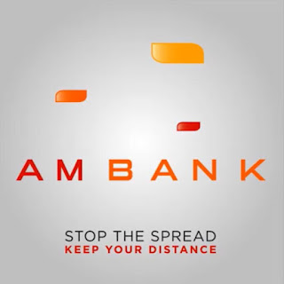
AM Bank - Coronavirus edition

AM Bank has toyed with its logo in social distancing act influenced by the Coronavirus. The move is brilliant - OK to be honest I wonder if it was influenced by Slovene artist Jure Tovrljan which went super viral I know not. But the AM Bank attempt is a good one nontheless.
Mastercard - Jure Tovrljan

Saturday, March 14, 2020

Kfardebian - the logo that works

I saw this logo on a backdrop of snow the other day and it really felt at home. I saw it later on a darker surface and it still worked albeit less but it still was distinctive. The Kfardebian logo, where there is a tad too much happening, somehow uses its minimalist effect to its best advantage by counter-balancing with minimal elements. And just in case you did not grasp the degradation of the leaves "a village for all seasons" is there to explain it all in terms of mood. Obviously the ultimate test for a logo is social media these days, and this one works, even if it could have benefited from the omission of the selling line as it gets unreadable in avatars (instagram as an example).

Monday, March 9, 2020

Hershey's Women's Day - a tailor-made campaign

Let's face it, no other brand could do this. Why? Because it is tailor-made to the name of Hershey's. Her/She bars were released withe name of trailblazing women to honor Women's Day. There you go - so specific to the brand it cannot be duplicated. Smart! This was done done in Brazil by the way...

Tuesday, February 4, 2020

Le pré - sips of nature

Well, this is a surprise: As far as I know, Le Pré is a new brand in the Lebanese market and I stand corrected if it is not so. But launching a natural juice at this time is nothing but gutsy (do not know if it is natural juice but certainly the packaging and branding both imply upper bracket juice - hence "natural"). With a signature like "sips of nature" as well, this certainly implies a "fancy" brand. Well, whereas limited, the ads show immediately as the absence of other ads in town makes any ad prominent these days! Here's my two cents: With a name like Le Pré, they missed the opportunity to use the classic French expression "le bonheur est dans le pré" - I know what you will say, "this will make it uppity French", but ahem, what language is Le Pré to begin with?