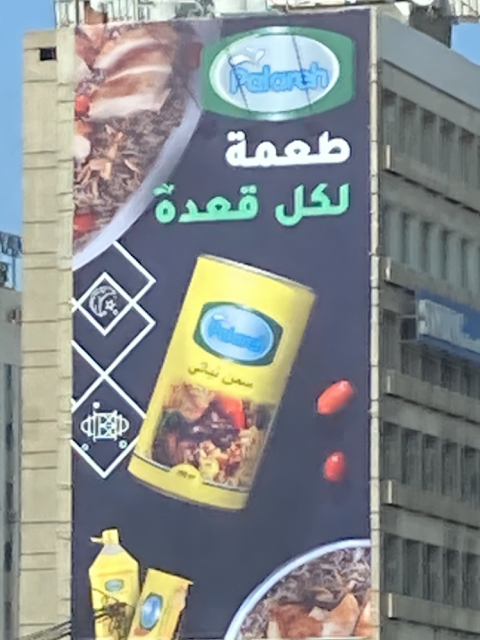
I can't believe I am saying this. The logo should be bigger.
First, the facts: Right bang on Easter and Eid el Fitr which fall back to back, and since Maamoul is the official cookie of both, and with the price getting too prohibitive in bakeries and sweet shops to buy the cookie in question, now comes the notion of homemade (or re-comes because it used to be prevalent in the past!) Maamoul. Now, some people do use ghee and not butter (brand historians might enjoy the Baqara Al Haloub cum Golden plate rebrand here).
Enter Palareh, a new brand of ghee in the Lebanese market. The issue? I can't for the life of me read their logo in their ad. Considering the brand is introducing itself to the market, and considering no one had heard of it before, well, yes I know it is heresy to say it but the logo should be bigger.
Their line "ta3meh la kel a3de" (a taste for every sitting) is OK, but only just. Had the brand been established already in the market, and this being a reminder ad, I think this would be just fine but for a new comer - and yes, even if there is little competition in terms of advertising on the market - this still feels too unreadable for a woman to walk into a shop and ask for it.

