Here's a thought, when a company changes its logo, it is either because it is changing its line of products, its target audience, and therefore its target market, or it has changed its whole mission statement. So when luxury companies rebrand, as in the chart below:

It was, almost always to announce the arrival of a new creative director. But such is the musical chairs play of creative directing that the turn over is so far it was not even worth it to rebrand the shops, the labels, the collections, the bags and whatever all else paraphernalia that needed rebranding. Most of the press releases when a new logo is born stress words like "humanizing" and what not. The reason is more simple. Social media. You need your logo to be as 2D as possible to be seen in places like Instagram or Tiktok.
The wave of car manufacturers who reworked their logo to fit social media is below:

Obviously, the "flatter" your logo is, the more visible and easy to read it will be online.
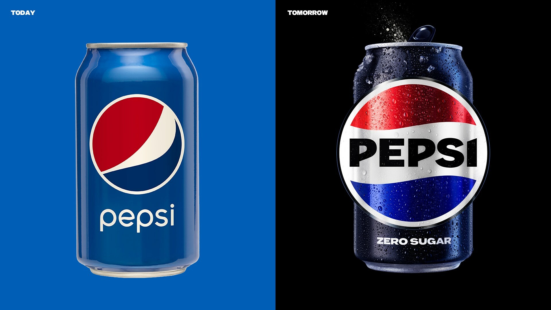
With this in mind, lately, Pepsi rebranded, with a beautiful new logo (here). Chloe (the fashion house) also has a new logo which harps back to its 70s iteration (a beautiful one at that). Zara did the same - for truly unknown reasons (here).
Which brings us to Decathlon, the latest in the chain of - I am changing my image, won't tell you why, you won't feel any difference, but let's see if it works. The old and new logo are posted on top: Here's a funny story. A friend of mine has three kids - each has a different sport hobby. She often shops at Decathlon accordingly. When I whatsapped her the image above, her reaction was: Which is which? She had no clue which was the new one (OK, to make it easier the one below), even if as a customer if should be "top of mind".
Seriously however, why bother? Sure, Decathlon phased several of their own in-house brands keeping "just" 80. People do not care about the sub-brands and just know Decathlon to be honest. And if my friend's example is of any worth - not even that well. And yet, the exercise continues - barely a week passes without any behemoth announcing they are rebranding, changing logos, changing identity - yet, I see very little of it trickling down to how their products are evolving, or how their target audience is morphing, or their positioning is.
I honestly don't get it - with 1700 shops in the world, Decathlon is up for a huge investment in changing their logo and applying it on all possible and imaginable products. What for? I have no idea.