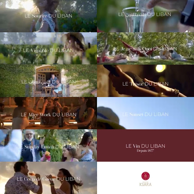
All right, everyone can go home. Ksara just launched its new ad. The visual is lovely etc... But it is the copywriting that completely left me taken aback. It. Is. Brilliant.
First it is French, which is reminiscent of the old Ksara language that it used to adopt in the 90s. But boom - inside there is Arabic "kes el ghiyeb" (a cup for the absent ones!) and "tilt b teltayn" (which is a nod to Ksarak the sister spirit of the wine produced by Ksara - which means "one third in two third" because this is how your "break" the Arak), now wait there's also "Sunday lunch" and "after work" too and that's English!....
Honest I was gob smacked. As I said, the visual is indeed nice and all, but when you ad such breathtaking copy whole thing goes to the power n!...
Wait, am I jealous?
See the full beauty of the Ksara ad here.

