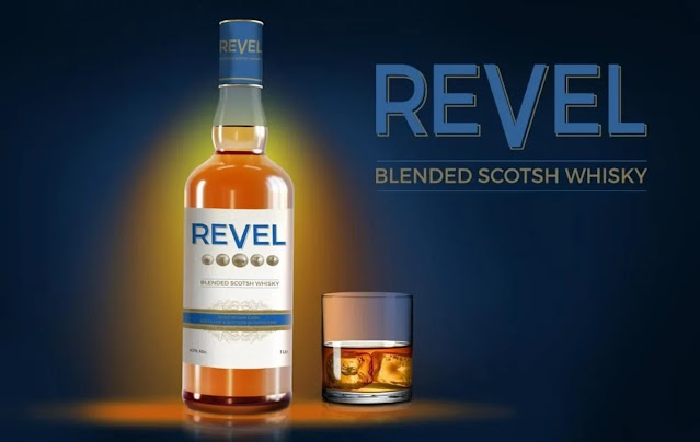
Hmmm, well, usually December is the date where established alcohol brands go with new ads (or reminder ads), but this year - considering that most scotch whisky brands are imported and ergo have stratospherically risen in terms of price, which is why seeing new brands (and untested in the market) pop up at this time is sort of interesting. But here we are, one of these brands is revel - with the very expected line that is "the new scotch revelation" (which makes the ad expected for me, but perhaps makes the public at large feel smart figuring it out).
Now, the issue is, why on earth is rendering of the bottle so incredibly two-dimensional and with such odd colors! Below is an image taken directly from their website showing a better image where the bottle seems at least rounded, but trust me in the ad above it seems flaccid. The other issue, the website writes it as "Scotsh" not Scotch Whisky which makes me doubt how languishingly proficient the company is.


